
‘Tis just as if I had known it, when, during chrimbo, I occupied myself with ↵creating complex airplanes out of square sheets of paper by folding only. Now geeks from Tokyo University teamed up with geeks from the ↑Japan Origami Airplane Association, and are planning to have an origami airplane, resembling the space shuttle in shape, launched from the International Space Station (ISS), have it enter the Earth’s atmosphere and then make a glide down to the surface. An 8 cm long prototype, wingspan 5 cm, chemically treated, making it “hard as glass,” of the origami shuttle already ↑underwent testing in the ↑hypersonic and high-enthalpy wind tunnel of the University of Tokyo at Kashiwa (that is in the Chiba prefecture, the very location where the opening chapter of ↑Gibson‘s “Neuromancer” takes place). It withstood wind speeds up to Mach 7, roughly 8500 km/h, without catching fire or disintegrating.
vectors
visions of dream machines

This is the “Vector W2” prototype of my teenage days in full flight. From certain angles it looks way more interesting than its contemporary successor, the “WX8”—both cars were briefly mentioned in ↵reventón, there also is a picture of the latter. Back in the 1980s the “W2” caused quite some talk, because it not only featured stunning looks—which made it appear in TV commercials and at least one movie—, but also was conceptualized as a ↑supercar, and beyond that thrived for the throne of the ↑fastest production car on the globe—a top speed of 320 km/h was claimed.
Its design obviously owes a lot to the original Lamborghini “↑Countach“—designed by the artistical genius of Marcello Gandini—, which went into production six years earlier, in 1974, and was produced in several versions until 1990. When looking on the car from different angles I also sense some elements of the “↑Lancia Stratos“ (designed by Gandini, too, and produced from 1972 to ’73) in it, and—forgive me—elements reminiscent of a pick-up truck. But that may well be my European arrogant prejudice against yank-cars, wonderfully summarized in this James-Bond quote—not from a movie, but from somewhere in the novels by Ian Fleming: “American cars have no character.” But enough of musings on æsthetics based on cultural socialization, because, as it is always the case with the modern anthropological gaze on material culture, what happens around the artefacts is of central interest.
The story of the “Vector” and its many manifestations is an astounding tale of tremendously courageous and ambitious projects, and at the same time of a series of successive failures and depressing desasters. In the wake of that it also is a story of a man who, when knocked down, is reluctant to stay on his knees, who never ceases to stand up again, starting over to mend his broken dreams. At Wikipedia bits and pieces of the picture are collected in the entries ↑Vector Motors and ↑Gerald Wiegert (I especially dig the André-Agassi anecdote)—although poorly backed-up with references. What I have read there, all over the Web, on Wiegert’s own sites (↑Vector Motors Corporation, ↑Vector Supercars, and ↑Aquajet), and in old automotive magazines I dug up from the cupboard, renders the picture of a very controversial personality, pursuing his dreams, bragging about achievements which are very much doubted by others, entangled in a mess of technology and economy. Without knowing the man in person it is very hard to form a clear opinion. It may well be impossible—thus are the complexities of human lifes in general, and individual biographies in particular.
Wiegert has a central idea in common with the late ↑Ferruccio Lamborghini: to build his own supercar. Everything else is not so much analogous. When Ferruccio decided to found ↑Automobili Lamborghini S.p.A., he not only was a trained and prolific engineer, but already a rich man, running a prospering company manufacturing tractors, Lamborghini Trattori S.p.A.. This succesful self-made man was very fond of sportscars and owned Alfa Romeos, Jaguars, OSCAs, Maseratis and Ferraris. Word has it, the story is supposedly related by his son, that Ferruccio was not content with the performance of certain parts of his Ferraris, the clutches in particular. So he drove to Maranello in order to meet Enzo Ferrari himself and make proposals for improvements. The latter duped Ferruccio by remarking that a manufacturer of tractors is hardly competent to judge the technology of sportscars. Another version goes, that Ferruccio not even came to see Enzo, but already was sent away by a secretary who commented that it was not house convention to let visitors directly step up to Mr Ferrari. The result would have been the same: Feruccio driving home enraged, deciding to create his own brand of sportscars, destined to jostle all others into the second league.
In contrast to Ferruccio Lamborghini, who was a professional, successful engineer and businessman when he started creating supercars, Gerald Wiegert was neither. When he founded his first company, Vehicle Design Force, in 1972. He obviously lacked resources in every dimension, but was driven by the powerful vision to beat the European supercars. It may appear somewhat far-fetched, but to a certain degree Wiegert from start on was in a similar situation like the ↵lorry blacksmiths of the Sudan are. Both are set to create vehicles which are absolutely cutting-edge in their respective peculiar contexts. Both are extremely budgeted and ultimately depending on infrastructures and markets way out of the reach of the own influence and control. Ferruccio was in the position to build engines and chassis’ from scratch, to hire the best men around, to have made the bodywork by Bertone, and so on. Wiegert had none of that. In a way Lamborghini and Wiegert represent the Lévi-Straussian archetypes of the engineer and the bricoleur. In respect to the economical dimension Wiegert aspired to accomplish an american dream, Lamborghini already had come from rags to riches.
The “Vector” has not yet reached its end point, Wiegert again is planning to reach for the crown with his “WX8”. By the projected top speed of 275 mph, equaling 442 km/h, it would beat the ↑SSC Ultimate Aero TT, which verifiedly reached 256.15 mph (411.76 km/h) on 13 September 2007.
hexagonal futurism
From November 1964 to the end of 1965 the trinity Gian Paolo Dallara (*1939), Gian Paolo Stanzini, and Bob Wallace in their spare time built the chassis of a new car by which they wanted to convince the old man, ↑Ferrucio Lamborghini (1916-1993) himself, to finally enter the racing circus. Ferrucio was delighted by the chassis and allowed the three to show it off at the 1965 motor show in Turin, Italy. Nevertheless he was reluctant to make a racing car out of it, but instead wanted to use it as the basis for a production car. For creating the body, Giuseppe “Nuccio” Bertone (1914-1997) was chosen. Being quite occupied at the time, Nuccio gave the assignment to Giorgetto Giugiaro (*1938), the best horse in his stable. The latter in turn passed it on to his assistant, Marcello Gandini (*1938). Thus it came that Gandini created what to my eye is the most perfect specimen of classical sportscar design, unsurpassed by anything else. Its prototype was presented in 1966 at Geneva, the Lamborghini “↑Miura“:

Taking a close look at the rear grill of the “Miura”, you discover that it consists of hexagonal honeycomb cells. As far as I know this design element indeed has been introduced to ↑Automobili Lamborghini by Gandini.

The old man obviously liked Gandini’s design very much, Gandini stayed with the company, and drew production cars for it way beyond Ferrucio’s times: the “↑Espada“, “↑Jarama“, “↑Urraco“, “↑Countach“, and “↑Diablo“. With the immediate project following the “Miura”, Gandini, in the positive sense, wreaked havok in the world of automotive design, with “futurism” written all across his forehead. He really feasted on the hexagonals, both interior and exterior of the 1967 Lamborghini “↑Marzal“ concept car are dominated by them—they even are repeated by the layout of the seats’ leather:


Now to something seemingly different. Here are two pieces of 2004 concept art showing the “Audi RSQ”, a prop for the cyberpunk movie “I, Robot” (2004) starring Will Smith. Of course the “design language” is radically different to the approach taken with the “Marzal”—little wonder, there are several decades in-between. But look at the “wheel” covers (there are no wheels envisioned, but the fenders house spheres):


There they are again, the hexagons. The structure of the front grill has been left rectangular, and the four interlinked rings of the Audi-logo still are circles—presumably in order not to destroy corporate identity design, and to leave the vehicle recognizable as an Audi. Me personally, I would radically have transformed both to hexagons as well—the grill with precise, sharp angles, the logo more rounded, still resembling the original one, and reminiscent of real honeycomb structure, which looks to me more like rows of circular drillholes, pressed to hexagons. [Note to the Audi design department: If you read this, remember that the contents of this blog are licenced ↑by-nc-sa
]

The resurfacing of the honeycomb structure on Audi’s silver-screen car may be explainable as a piece of company tradition, though. Since the hexagons as a design element were introduced with the “Miura” in 1966, they reappear on the Lamborghinis until the present day. Even on the youngest model, the “Reventón,” they are to be found. Since 1998 Lamborghini is owned by Audi [which in turn is owned by Volkswagen]. The passing-on of the hexagons is speculation, of course, but it may be the case.

My next example can not be explained away by the argument of in-house tradition. Here is a detail of an ingame screenshot made within the cutting-edge computer game “↵Crysis“, showing the “nanosuit” the player character wears:


The second picture is a detail of a promotional image, “explaining” the parts of the fictional nanosuit—mind the background. All in all the hexagon pattern is the dominant element of the overall graphical branding of the product—it is to be found everywhere: on the website, in logos, on the retail package, and the ↑nanosuit trailer completely capitalizes on it.
So what is it with the hexagons as a design metaphor for highest-tech? ↑Bionics ↵again? This time not as a symbol for a technology set in the alternate Victorian reality of steampunk, which has not yet freed itself from the need to copy nature, but bionics as an approach symbolizing a technology which already is beyond the contemporary state-of-the-art, stoutly pointing to the future? Or has it nothing at all to do with bees, and the hexagonal tesselation has simply been chosen because it is the most complex looking of the three possible ↑regular plane tilings?
reventón


This by far is the most aggressive looking piece of automobile I ever saw. Definitely not ↵steampunk, but a cyberpunk-worthy folly—a car with a basic price tag reading one million Euros, without tax still, and I do not want to know, how much of fuel it digests while covering 100 kilometres—in twenty minutes that is. But let us not discuss this issues now—there is nothing to discuss at all in this respect, in my opinion, because it is obvious that this beast called the Lamborghini “Reventón” simply is an insanity of which only 20 pieces will be manufactured. That settled, now let’s talk æsthetics and design.
Three years ago Lamborghini presented the ↑Concept S, which I back then associated with the ↵history of the Batmobile. With the now revealed “Reventón” they again created a car worthy to be driven by the Dark Knight. This time they completely revived the “aztec architecture” of the legendary “↑Countach“, of which the thing to be seen above is yet another reincarnation.

Just a dash of my crooked thinking: The much quoted, and quite obvious, inspiration the designers harvested from stealth airplanes—fighter jets like the “↑F-22 Raptor“ or ground attack aircrafts like the “↑F-117 Nighthawk“ (above)—makes it easier for both, 3D-artists specializing in low polycount modeling, and for ↵origami artists, to make naturalistic renditions of the “Reventón”. By the way, it is not the first so-called “supercar” of which its designers say that it was inspired by military aircraft.
Word has it, that the 1980 prototype concept car “↑Vector W2“, and its production (1989-1993) successor, the “↑W8“, plus some occult successors more, manufactured by a row of companies owned by ↑Gerald Wiegert were inspired by the “↑F-16 Fighting Falcon“ and/or “↑F-18 Hornet“. The latest installment, the “WX8” prototype, was presented at the 2007 Los Angeles Auto Show alongside a poster showing the car in front of a “F-22”:

welcome back to bright falls
cyberian nomadism confirmed

Once a real member of a real online community, always a member. ADM, whom I know since ye olde days of Max-Payne glory, yesterday evening sent me an e-mail, notifying me of the resurrected ↑BrightFalls.net—plus dipping my nose into the fact, that the Alan-Wake related links in the sidebar of my blog are outdated.
The relaunch of ADM’s site is a perfect up-to-date example of what, among other things, I am always bragging about in the academical realm:
In his inaugural entry ↑Welcome back to Bright Falls! ADM has written up the story of the relaunch. To proof my point, in order to preserve valuable field-data, that instead ↵may well vanish, and by sticking to the motto “let cyberia’s emical voices be heard,” I quote it here in full:
We have been hard at work for the past couple of months developing a news site that allows you to interact and comment on the latest Alan Wake news direct from Remedy or the community. Through services like ↑Twitter, ↑Facebook and our ↑inbuilt RSS feed you are able to follow the news no matter where you are via E-mail (Twitter), SMS (Twitter), Web (Facebook/BrightFalls.net) and even Instant Messenger (Twitter)!
Just a little history for all you new folk out there. BrightFalls.net has been around in some form or another since early 2005 where we launched the community site AlanWake.net, the first Alan Wake fansite on the net and what would later become the official community site. AlanWake.net went down at the start of 2006 where it was merged into AlanWake.com and can now be found in the form of the ↑Alan Wake official forums. Since then the news was one area which wasn’t handled very well within the forums and there were a number of attempts to get a dedicated news site up.
BrightFalls.com was one of those attempts, which due to a database corruption prematurely exited the online world. BrightFalls.com no longer is running and for anyone who still has the bookmark for that site please update it to BrightFalls.net.
We tried to recover as much older news as we could and theres even a ↑nice little Christmas present from Remedy which offers you a new screenshot [see above]. We know it’s not much but it’s the best we could do during this media blackout. If you crave some info on the game then may I suggest heading over and checking out our ↑in-depth Alan Wake FAQ where we answer every single question currently known about the game?
So that’s about it. Browse around the site and be sure to comment on the news (don’t need to register but it would be nice, it would also allow you to enter competitions and more features in the future!). If theres something you’d like to see here then feel free to post a reply here.
We hope you like the new replacement for the Alan Wake news forum, BrightFalls.net.
nemo’s gear
steampunk informed appropriation of mythical worlds and hardware
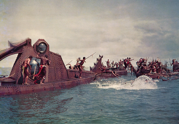
It was clear as a scuttle—sometime around Christmas they would re-air “↑20,000 leagues under the sea,” the 1954 Disney rendition for the silver screen of ↑Jules Verne‘s ↑1870 novel. They always do, and so they did this time. Just having read ↑H. G. Wells‘ brilliant scientific romance “The first men in the moon” (1901), rewatching “Leagues” came in handy and forcefully threw me back into my embracing of steampunk æsthetics. Accordingly I haunted the Web for material and found that Captain Nemo’s submarine “Nautilus” is maybe the best researched and documented steampunk artefact around.
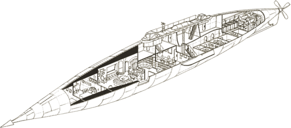
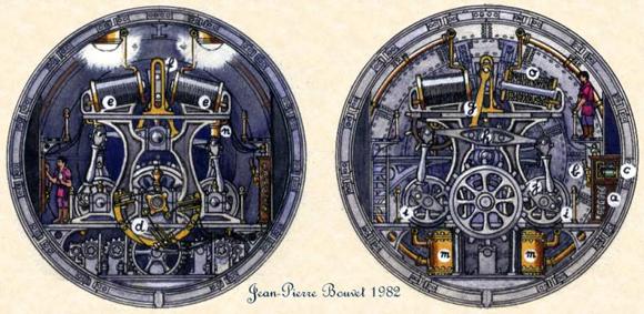
Michael & Karen Crisafulli’s ↑Twenty Thousand Leagues under the Sea website is a large compendium of research on ↑Verne’s Nautilus as described in the original novel. Besides a lot of own research and work, there is a ↑catalog of “nearly fifty concepts in words, two and three dimensions,” bringing together a lot of different research and creativity. The ingenuity of the people dealing with the “Nautilus” by far surpasses mere design, but goes in-depth into retro-invention of e.g. machinery itself, as e.g. ↑Jean Pierre Bouvet’s concepts for the vehicle’s engine demonstrate.
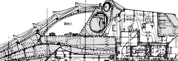
Besides this projects based on the canonical text, there is research on second order artefacts. That means research on interpretations—especially the version created by ↑Harper Goff (1911-1993) for the movie directed by Richard Fleischer:
The story is that the Disneys wanted a simple cigar-tube hull rather as described in the novel and not unlike contemporary submarines. Harper Goff preferred an intricate Victorian appearance but could not convince the studio heads. He scratch-built this concept model over a long holiday weekend. Walt Disney was taken by the model and Goff’s concept prevailed. […]
Rather than the stark utilitarian exterior that Verne described and Neuville and Riou drew, Goff extended the ornate Victorian interior decoration to the hull and deck. He enhanced the monster impression by adding reptilian fins and protuberances and gave the pilothouse a crocodilian look. I think he wanted movie viewers to come away with an impression equivalent to that of Verne’s readers in the previous century. People used to the sailing and steam ships of the mid-1800s and unfamiliar with submarines would see and remember a low sleek hull as monster-like. Moviegoers in the 1950s knew what a submarine looked like, but they had never seen anything like this Nautilus. [↑The Catalog of Nautilus Designs]
Goff’s somewhat ↑bionics approach strikes the fancy of quite a community—↑Disney Sub‘s motto is “Honest to Goff” and brings together a ↑plethora of research and artistical recreations.

Science Fiction fans in general, and for instance Star-Wars followers in particular, go for lengths in practicing this kind of research on storyworlds, on the universes of literary and movie fiction. Professional academics have driven this practice to the extreme, producing astounding and sometimes very applicable results. The absolute top-of-the-heap may be physicist ↑James Kakalios‘ ingenious book “The physics of superheroes” (↑2005; Gotham, Penguin). If you have no clue about how to lead your teenage kids to the joys of natural science, go and grab this masterpiece. If this proposal sends shivers down your spine, because you as a rational and secularized being loath superheroes, then dive into ↑Harold Schechter‘s “↵New gods: Psyche and symbol in popular art“ (↵1980) and emerge the wiser. Seen from my vantage point all this are instances of cognitive appropriation of mythical worlds.
At times this is driven even farther by transgressing the boundaries between the categories cognitive appropriation and reworking or modifying, as there are those who transpone their gained knowledge about mythical things to the creation of original artefacts. There is a lot of art around which clearly is informed by the conventions of steampunk, but of peculiar interest are those artefacts which are not mere carriers of a recognizable set of æsthetics, but are functional in an analogous context as the one of their fictional antetypes. Steampunk-styled sculptures to be exhibited in artsy galleries are all very well, but in the vicinity of cyberpunk or steampunk most artefacts which make their appearance are machines of some provenance. Only with the creation and/or modification of functional machines the different principles of appropriation fuse and come full circle.
A most impressive instance of this is Patrick Regan’s work. Pat, proprietor of ↑Vulcania Submarine, Hawaii, is a diving and underwater technology specialist:
Our R&D with underwater technologies led to the development of a closed-circuit engine system we believed capable of powering a submarine. Next, we developed and built a steel pressure hull for a High Performance Submersible project we called the ↑HYPERSUB. The intent was a minisub capable of high speed and long endurance, for whatever practical purposes such might have. […]
One night while I was doing a rough sketch of a crash-bar to protect the front view ports, I visualized the HYPERSUB running fast awash, and the image of Captain Nemo’s NAUTILUS on the attack came to mind. I did the math and realized it might just be possible to build a steel NAUTILUS replica outer hull around the HYPERSUB pressure hull. Because 20,000 LEAGUES had been the movie that started my interest in underwater technologies as a young boy; and because there had never been an actual manned submarine of Disney NAUTILUS configuration in any scale; the project seemed worthwhile. And from that moment on the HYPERSUB project became the ↑NAUTILUS MINISUB.

Just in case you missed it, the gist of this is, that Pat has built a functioning minisubmarine with the faithful looks of the 1954 movie version at a 1/10th scale.
There is a video of Pat’s 1991 test run of ↑his minisub at YouTube. In 2001 he started to ↑rework the submarine and graced it with scale exterior detail for a Discovery Channel program. But he did not stop at that. Meanwhile he has created several versions of the ↑diving helmets and suits of Captain Nemo and his crew and the ↑underwater rifle seen in the movie as well—everything fully functional! That way Nemo’s gear finally has left the realm of fiction and has come to this world.

steampunk credo

Rich “↑Datamancer“ Nagy specializes in “prestidigital datamancery & paraphernalic technofetishism (now with 20% more superfluous pleonasm!!).” In strictly out-of-character words: he makes customized steampunk-themed computer hardware to order. Here is a long quote, illustrating the ↑rationale behind his occupation:
When the steam train roared into history, hissing smoke and howling into the night, it was an awesome beast, adorned in the finest woods, ivory, gold, and intricate inlays, like some Serpent King on a sacred tapestry. The automobiles of the 20’s to 60’s, each was a work of art. The television and radio affected the world in more ways that can be imagined, changing the entire dynamic of human social structure and communication. They were both appropriately gifted with the most lavish of hand tooled, wooden scrolled cabinetry, housings which borrowed architectural details from the grandest schools, churches and banks.
Sadly, the personal computer, which has impacted the world more profoundly than probably all of the previously mentioned inventions put together, never recieved the same kind treatment. It went from a buzzing beige cube, to a buzzing white one, to the garish space-eggs you see nowadays. The train is a chain of linked rectangles, the automobiles have devolved into these crappy little automobubble spheres, and TVs/radios are about as lavish and attractive as a 2 X 4. But that’s another rant. What I’m trying to do is retroactively create a false period of greatness in computing. The “Golden Days” of the PC, so to speak. I’m building a blazing-fast, modern computer into antique fine cabinetry. I’ve been stalking Ebay for about a year now, and I’ve finally gathered just about everything I need. It took me a long time, because I had to find pieces of broken or useless antiques to modify. I couldn’t bring myself to destroy anything good. I figure, if it survived this long, who am I to destroy it? Also, the old hardware has a soul to it that the new crap doesn’t, so I’d almost feel like I was killing it. But I digress….as always. [emphasis mine]
effect

‘But did you—are you sure? Suppose a mirror for instance—hallucinations are so easily produced. I don’t know if you have ever seen a really good conjuror—’ (Wells 1995 [1897]: 48)
WELLS, HERBERT GEORGE. 1995 [1897]. The invisible man. London: Everyman.
maxmod: an ethnography of cyberculture
Finally the definitive abstract of my project—out of which I now have to write a book as quickly as possible—exists. Here are the English and German versions of the abstract:
The project is based upon longlasting and sustainable anthropological fieldwork, which essentially happens within conceptual spaces of interaction spanned by the infrastructure of the Internet. Central concepts of the methodological access are thick participation (Spittler) and multisited ethnography (Marcus). For being able to grasp the sociocultural phenomena empirically observable online, genuine anthropological research methods are evaluated and then transposed to the new fields. Building upon this, and upon the fieldwork results, a systematic basis for the establishment of a new subarea of anthropology—’cyberanthropology’—is created. Within the framework of the thus designed subarea, and starting from existing models (Escobar), ‘cyberculture’ is newly conceptualised as consisting of the four elements technology, cybernetics, sociocultural appropriation, and cyberpunk. From those the principle of appropriation (Beck) is the central research paradigm of the whole project. The reach of the developed concept of culture enables us to recognize online mediated interaction as embedded into a larger whole—as an aspect of certain ‘Lebenswelten,’ which are of crucial importance for contemporary politics, economy, and society. The project renders the culture of this ‘Lebenswelten’ understandable, and it is shown that transnational technoludic online communities of practice, which are in the focus of the fieldwork, not only constitute a technological, but also a sociocultural avant-garde of present time.
Zusammenfassung
Das Projekt basiert auf langandauernder, nachhaltiger ethnologischer Feldforschung, die wesentlich in, von der Internetinfrastruktur aufgespannten, konzeptuellen Interaktionsräumen stattfindet. Zentrale Begriffe des methodischen Zuganges sind Dichte Teilnahme (Spittler) und multi-sited ethnography (Marcus). Um die online empirisch wahrnehmbaren soziokulturellen Phänomene erfassen zu können, werden genuin ethnologische Forschungsmethoden evaluiert, und für die neuen Felder transponiert. Darauf, und auf den Feldforschungsergebnissen aufbauend, wird eine systematische Grundlage für die Etablierung eines neuen Teilbereiches der Ethnologie— “cyberanthropology” —gelegt. Im Rahmen des entworfenen Teilbereiches wird, ausgehend von bereits existenten Modellen (Escobar), “cyberculture” als aus den vier Elementen Technologie/Technik, Kybernetik, soziokulturelle Aneignung und “cyberpunk” bestehend, neu konzeptualisiert, wobei davon das Prinzip der Aneignung (Beck) den Platz des zentralen Forschungsparadigmas des gesamten Projektes einnimmt. Die Reichweite des entwickelten Kulturkonzeptes erlaubt es, online vermittelte Interaktion als in ein größeres Ganzes eingebettet, als einen Aspekt bestimmter Lebenswelten zu erkennen, die von zentraler Bedeutung für zeitgenössische Politik, Ökonomie und Gesellschaft sind. Die Kultur dieser Lebenswelten wird verstehbar gemacht, und es wird gezeigt, dass die, im Fokus der Feldforschung stehenden transnationalen, technoludisch orientierten online communities of practice nicht nur eine technologische, sondern auch eine soziokulturelle Avantgarde der Jetztzeit darstellen.
The project’s complete exposé is all in all twelve pages long, including references. Until now only the German version is finished. As soon as the English version is finished, too, I will bring both online.
pondering wiki reciprocity

“Wikipedia is like ↑bittorrent, if people are interested in a specific article, it get[s] better.” (↑comment by soobrosa to ↑Academia and Wikipedia by Danah Boyd) This is not brandnew, I know, but in the face of my pressingly upcoming ↵teaching project, I just unearthed this from my HDD filing cabinets—and those, too: ↑Situating Wikipedia by Danah Boyd, ↑Who’s afraid of Wikipedia? by Clay Shirky, ↑Wikipedia by Clay Shirky, ↑K5 Article on Wikipedia Anti-elitism by Clay Shirky, and ↑Why Wikipedia Must Jettison Its Anti-Elitism by Larry Sanger. Connected to the issue, but with a twist, are ↵defrag wikipedia, ↵trail of sources, and ↵further trails of sources.

